TLP brand resources and guidelines
Vision
Anyone who feels life is no longer worth living can find a confidential place with a compassionate listener who will give them time.
Mission
To provide face-to-face support for people who feel life is no longer worth living.
Values

Caring

Collaborative

Courageous

Resolute

Respectful
Logo
The TLP logo is central to our brand and the most recognisable element of our brand identity. It must be presented consistently by only using the master artwork from our logo library.

Safe zone
The logo should have enough space around it to maintain legibility. The exclusion zone is equivalent to the height of the ‘g’ on all sides.
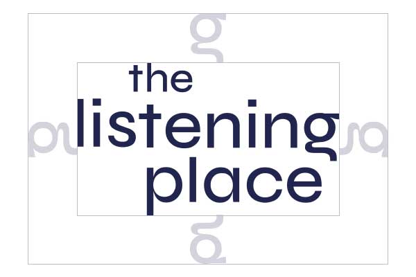
Minimum size
The minimum logo size for digital applications is 90px wide. In print, the minimum size is 30mm wide.
Things to avoid
Using our logo consistently ensures brand recognition and allows for creativity elsewhere. Avoid these usages:

Don’t stretch
Don’t change the colour
Don’t add a drop shadow
Don’t replace the font
Don’t make the logo 3D
Don’t rotate
Brand mark
The TLP brand mark is to be used primarily on internal marketing material and comms. The mark can also be used for all social media channel profile images and digital assets.
Colour palette
Primary colours
Burnt orange
CMYK: 17, 69, 90, 6
HEX: #c7622b
RGB: 199, 98, 43
Apricot
CMYK: 0, 60, 75, 0
HEX: #F08046
RGB: 240, 128, 70
Indigo
CMYK: 100, 93, 35, 37
HEX: #22234F
RGB: 34, 35, 79
Secondary colours
Dark Fuchsia
CMYK: 45, 95, 25, 10
HEX: #932969
1RGB: 47, 41, 105
Wisteria
CMYK: 85, 82, 17, 3
HEX: #494282
RGB: 73, 66, 130
Sky Blue
CMYK: 75, 20, 10, 0
HEX: #219ECB
RGB: 33, 158, 203
Teal
CMYK: 80, 30, 40, 15
HEX: #257d86
RGB: 34, 35, 79
Jade
CMYK: 70, 5, 60, 0
HEX: #48AD82
RGB: 72, 173, 130
Amber
CMYK: 0, 30, 75, 0
HEX: #FBBC51
RGB: 251, 188, 81
Typography
Poppins
The brand typeface is Poppins, a geometric sans serif typeface that is clean, modern and free to use.
ABCDEFGHIJKLMNOPQRSTUVWXYZ
abcdefghijklmnopqrstuvwxyz
1234567890
Typesetting hierarchy
Using the font confidently helps deliver a clear and structured message. Being consistent is key!
Headlines set in Poppins Bold
Subheads set in Poppins Medium or SemiBold
Body copy set in Poppins Regular. Lorem ipsum dolor sit amet, consectetur adipiscing elit. Proin ac vestibulum purus. Curabitur aliquet sagittis leo eu euismod. Donec vel lacinia lectus. In hac habitasse platea dictumst. Nam sed sem eu risus fermentum sagittis id a ex.
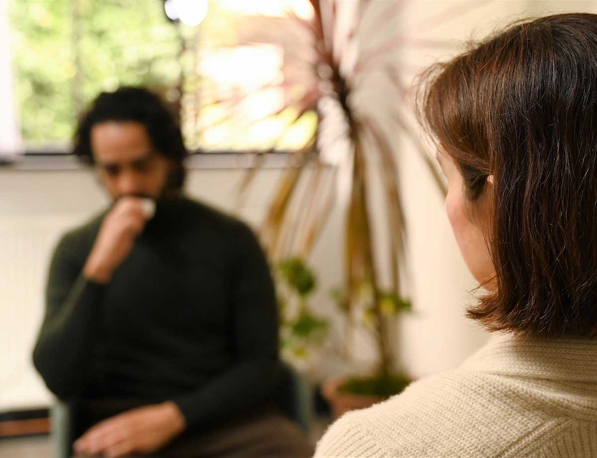
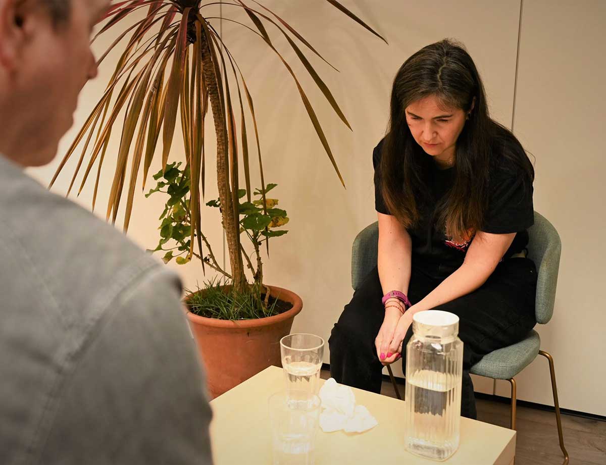
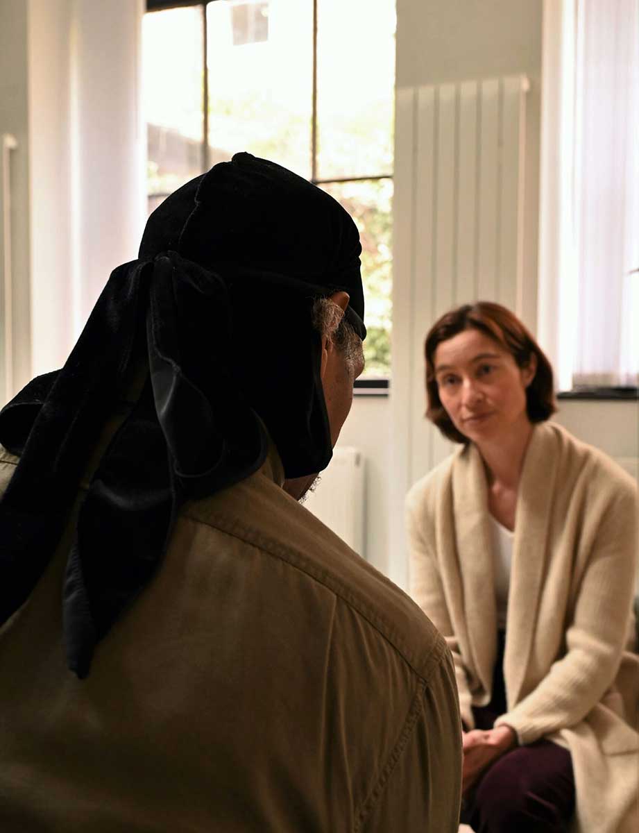
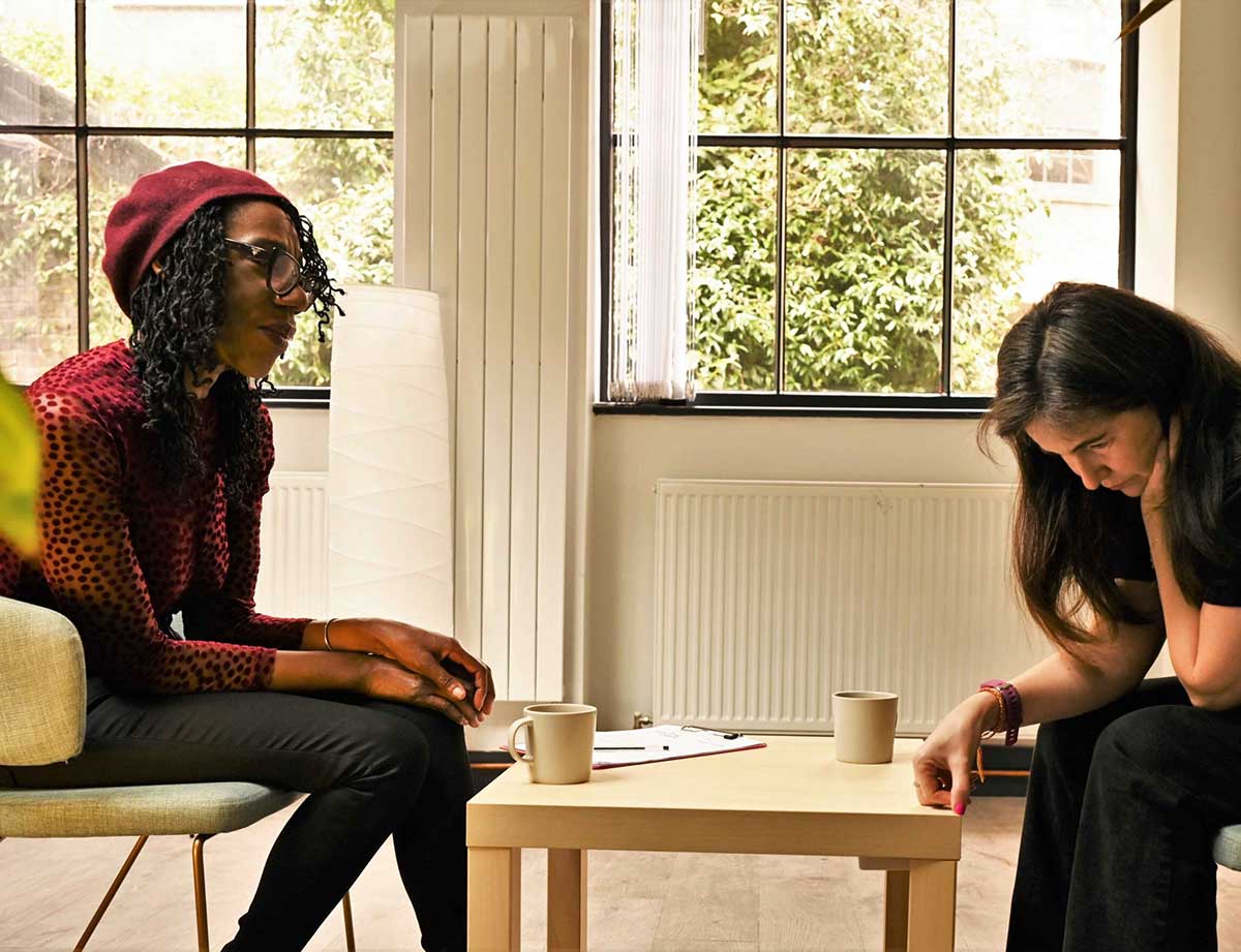
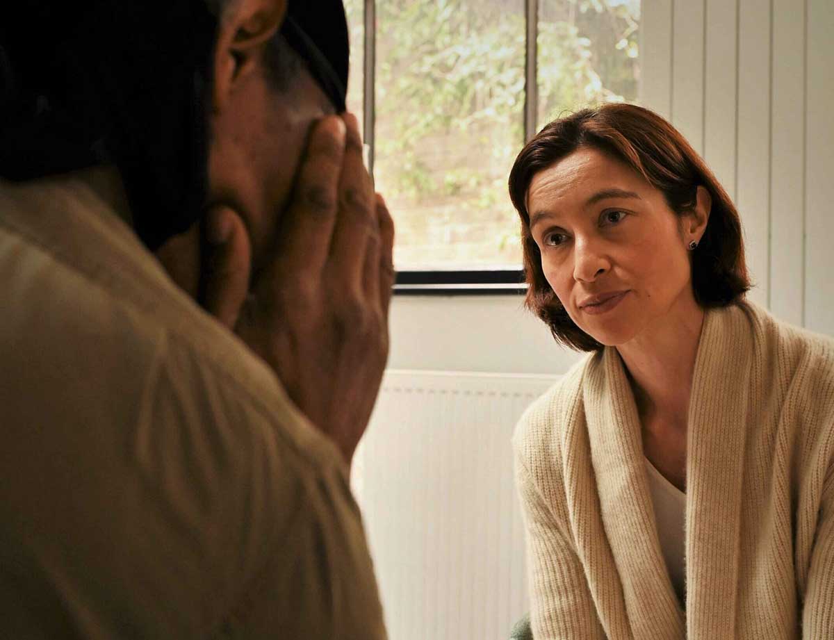
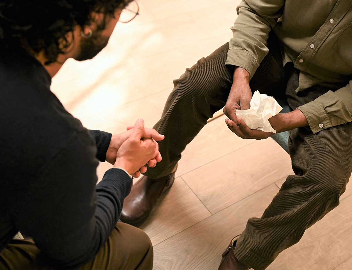
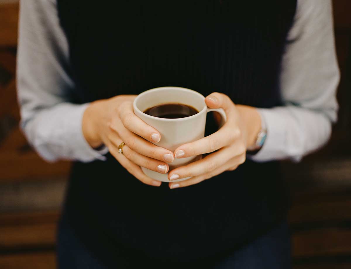
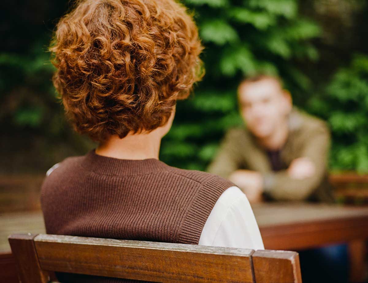
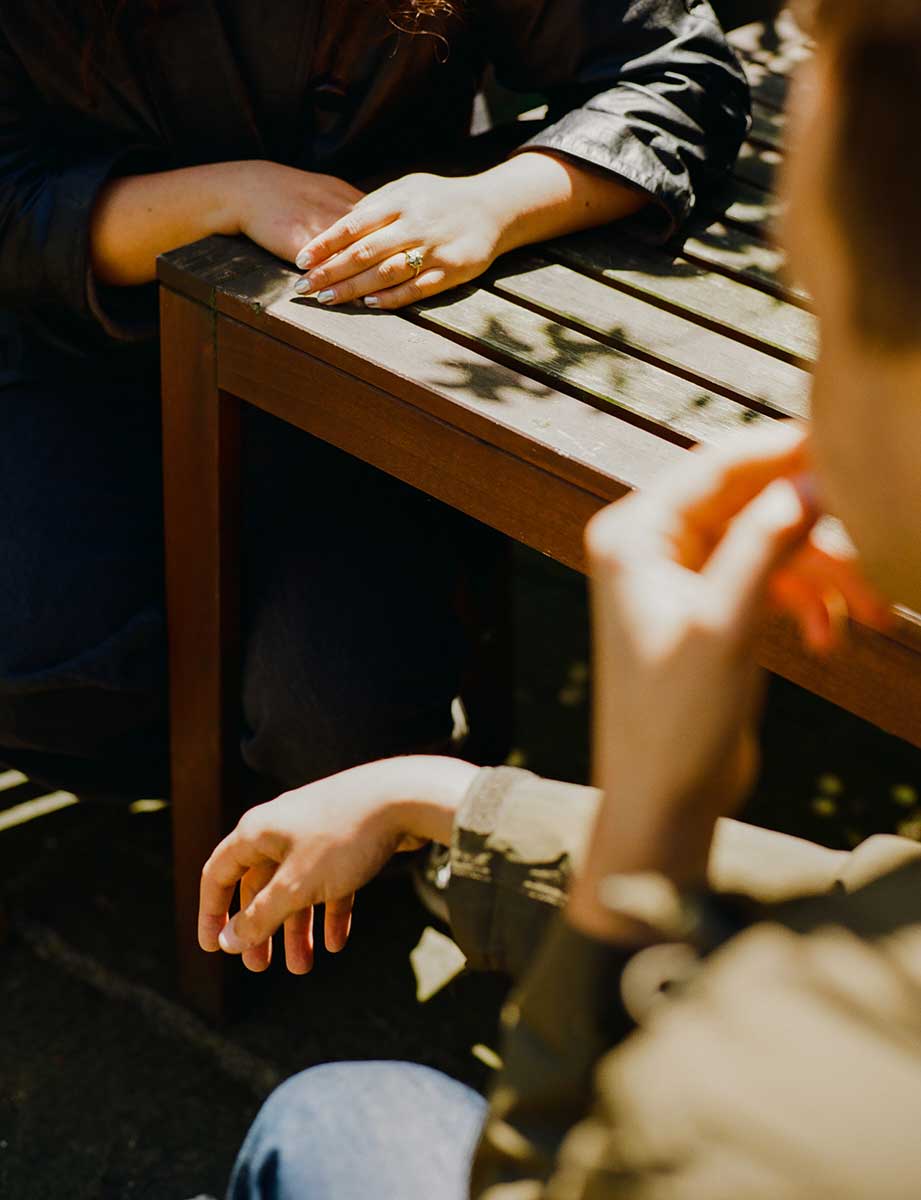
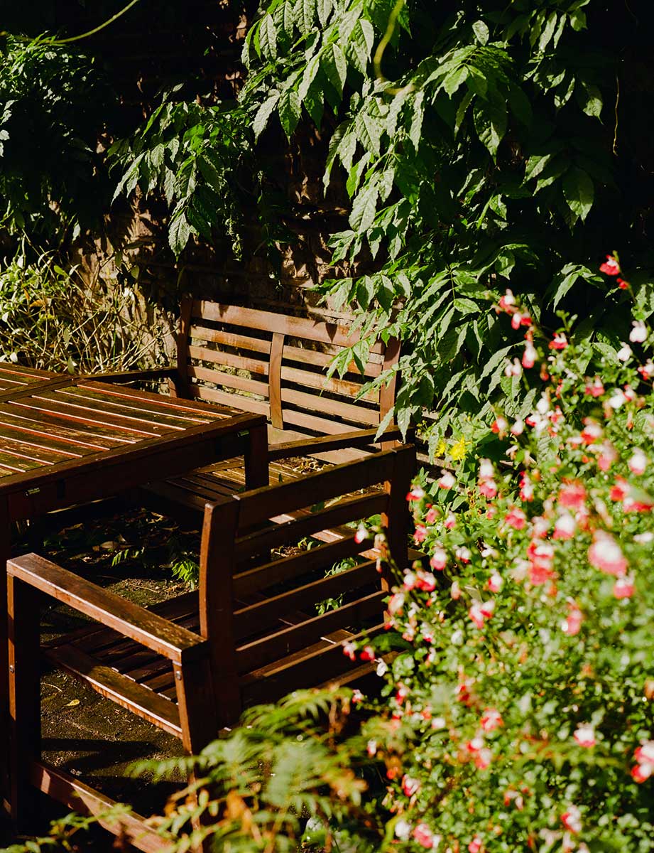
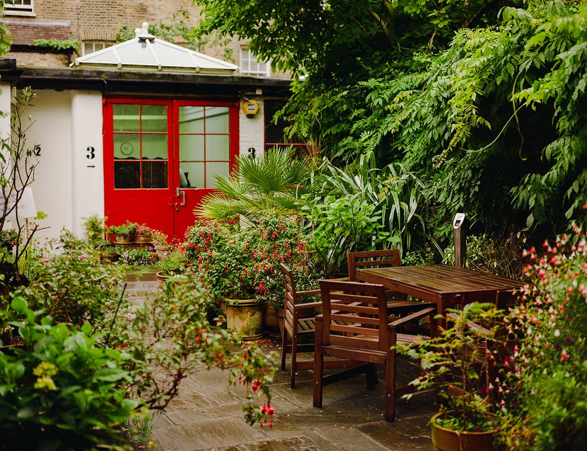
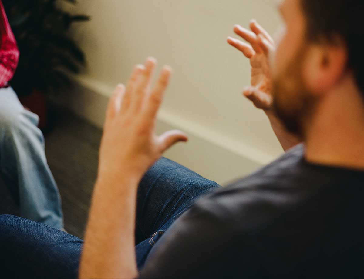
Photography
TLP photography captures the essence of the TLP mission: to provide face-to-face support for people who feel life is no longer worth living. It is diverse, inclusive and represents both TLP’s visitors and Listening Volunteers.


Iconography
Iconography
The TLP icons provide personality and character and help signpost communications or visually complement our communications.
All TLP icons show a consistent style.
